Zig Zag Layout
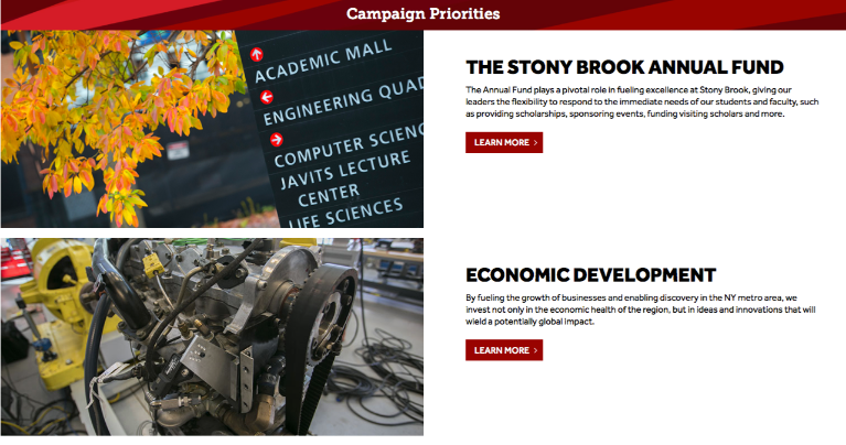
The Zig Zag Layout snippet gives you a multi-row, 2-column layout where featured images alternate right and left, with text or other content next to each associated image.
IMPORTANT: This is a full-width Promo Section snippet, not to be used in a Main Content Area.
Demo
How to Use
Note: only use this snippet in a Promo Section, not in a Main Content Area.
It is also recommended to use this snippet after another snippet or use a "Rays Full Width Band Heading" before the Zig Zag (see demo screenshot below).
- Click on the "Insert Snippet" button.
- Search for "Zig Zag Layout" or select it from the 'Page Layouts' category.
- Click the blue Insert button.
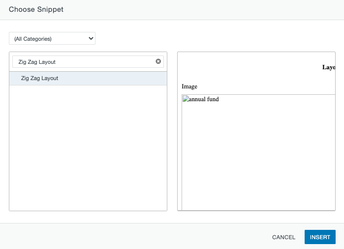
- The snippet will look like this after it's inserted:
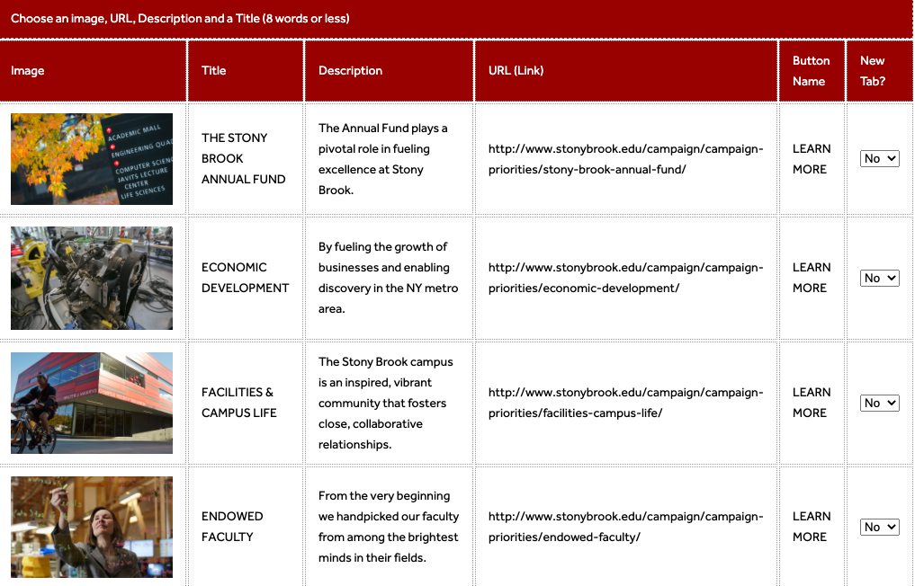
- You can insert an image, title, description, and a link for each item. You can also adjust the output of the button name or remove it entirely by leaving that field blank.
- The image size should be at least 600 pixels wide but could be larger, and likely will be horizontally oriented. Try for a 4:3 width-to-height ratio if the amount of text is such that the image will appear horizontal and at that aspect ratio.
- However, the more text you have for each row, the taller the text box will grow, which means the image will appear more square or even vertical. So the image you choose will depend somewhat on the amount of text you have for each row.
- The final result looks like this (note that there is minimal text per row, so the
images are horizontally oriented):
Alternate Layout Options:
Within the snippet table, there is a section for a snippet layout. The default layout is set to Zig-Zag.

Content Left:
If you prefer the content on the left and the images on the right, this is the result.
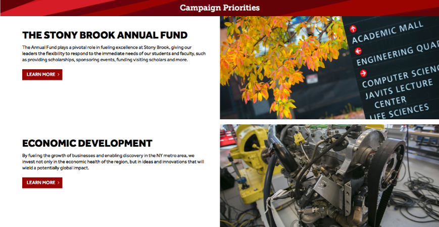
Content Right:
If you prefer the content on the right and the images on the left, this is the result.

Zig Zag Grid:
There is a second Zig Zag option called Zig Zag Grid, which has two text blocks and images per row, creating a grid-like pattern.
Text and images are managed the same way, just note that the images here will likely be square to slightly vertical.
See a demo here.
